Irresistible Calls-to-Action: Transform Your Cold Emails Now!
Each email you send is a golden opportunity to make a positive impression of your brand. Yet statistics show a daunting reality: the average cold email response rate hovers around 1%. This number paints a grim picture of ignored messages and missed connections.
As such, you must capture attention and compelling action in succinct words. This is where a well-crafted call to action (CTA) can transform your cold emails from overlooked to irresistible.
A suitable CTA can turn passive readers into active responders and significantly boost your campaign's success rate.
This guide explores the art and science of creating CTAs that resonate and convert, equipping you with the tools to elevate your cold emailing game.
How to Create Effective CTAs Within Cold Emails
These tips will help you write compelling CTAs to boost the success of your cold email campaigns.
1. Focus on Clarity and Specificity
A CTA in a cold email should guide the recipient clearly and decisively toward the next step. The more specific and unambiguous the CTA, the higher the chance of the recipient taking the desired action. Here’s how you can achieve this:
A. Use Clear, Concise, and Action-Oriented CTAs
To ensure maximum impact, your CTAs should be brief yet powerful, pushing the recipient toward taking action.
For instance, avoid broad invitations like "Click here." A more effective CTA would be "Book your 30-minute consultation now!"
This approach specifies what to do and what the recipient will gain, increasing the likelihood of engagement.
According to a study, a single clear CTA in an email can boost click-through rates by up to 371% and sales by as much as 1617%. These figures showcase the power of precision in CTA design.
B. Avoid Ambiguity and Vagueness
Vague CTAs often lower engagement rates because they fail to convey the action's urgency or value.
For example, a CTA like "Learn more" is less compelling than "See how you can increase your revenue by 20% with our tool."
Providing specific benefits in the CTA can significantly enhance its effectiveness. This is especially true in B2B contexts, where outcomes and returns on investment are key decision-making factors.

Why does this work?
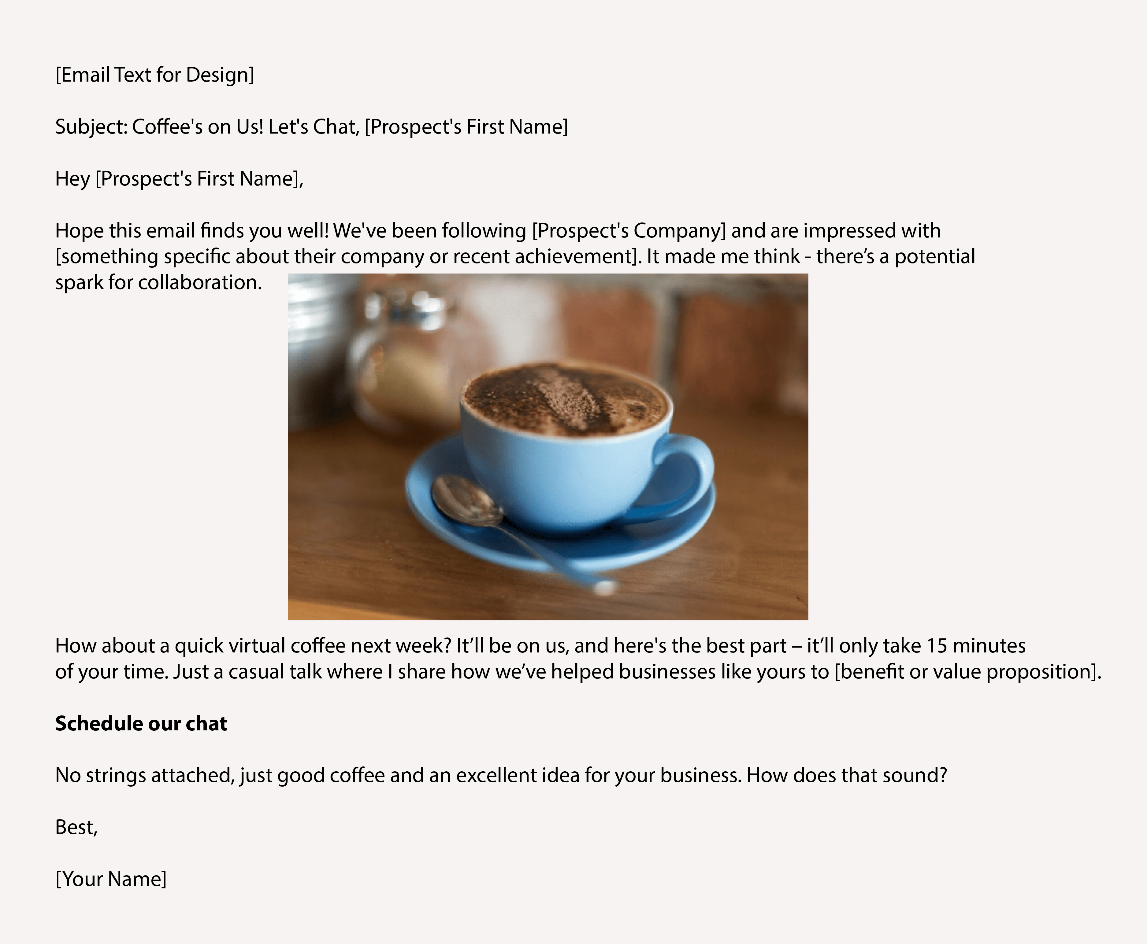
- The content is engaging and personalized, mentioning the recipient's company.
- It specifies the action clearly: A 15-minute virtual call.
- The CTA is concise, with only four words as a hyperlink: "Schedule our chat."
- It includes a scheduling link for ease of meeting arrangement.
2. Leverage Segmentation and Personalization
Statistics show that personalized CTAs that directly address the recipient's needs and interests can increase conversion rates by up to 202%.
Here’s how to apply segmentation and personalization to create compelling CTAs for different audience segments:
A. Tailor CTAs for Industries
Segment your audience by industry and craft CTAs that address industry-specific challenges or opportunities.
For example:
- For the healthcare sector, use a CTA like "Discover healthcare solutions that improve patient outcomes."
- For a technology business, use a CTA like "Leverage advanced tech to drive your business forward."
B. Use Role-based Segmentation
Understand the roles of the recipients in their companies.
- A CTA for a C-level executive might be "Gain strategic insights for business growth."
- A mid-level manager might respond to – "Enhance your team’s productivity with our tools."
C. Create Behavior-Driven CTAs
Analyze past interactions with your emails and website. If specific segments regularly engage with content on leadership development, your CTA could be "Join our leadership masterclass to drive change."
D. Focus on the Buying Cycle Stage
Tailor your CTAs based on where the prospect is in the buying cycle.
- For early-stage prospects, use educational CTAs like "Learn more about industry trends."
- Later-stage prospects might respond better to "Request a demo of our solution today."
Check out this comparison of probable CTAs for IT managers and CEOs:

IT managers and CEOs are directed to the same CTA focused on securing data with cloud solutions. However, the messaging differs slightly to cater to their interests:
- For IT managers, it emphasizes data security.
- For CEOs, it highlights business empowerment and scalability.
3. Master Strategic Placement and Design
Achieving the right balance in CTA placement and design is vital for maximizing the impact of your cold emails. It ensures your message captures attention and prompts action. Here are some tips:
A. Optimally Place CTAs Within Your Content
The strategic positioning of your CTA can significantly affect its performance. Naturally, integrating the CTA within the flow of the email content is essential.
It ensures your message stands out without disrupting the reader's experience. This approach can also enhance the user experience by making the transition from reading to action smooth and logical.
Strategies for Positioning CTAs:
- Place them near the top of the email to catch early attention.
- Put them at the end to provide a clear next step after conveying the message.
NOTE: For longer emails, a CTA can also be placed in the middle to remind or reinforce the action you want the reader to take.
B. Emphasize Visual Design Elements
The visual aspect of your CTA plays a pivotal role in drawing the recipient's attention and encouraging clicks.
So, utilize visual cues like buttons, contrasting colors, and bold font styles – to significantly increase the CTA's visibility. For example, a bright-colored button with a concise, action-oriented phrase can catch the eye faster than plain text links.
Here, the psychology of color comes into play. Certain colors can evoke specific emotions and actions:
- Red: Energetic and creates urgency, often used for clearance sales.
- Blue: Denotes trust and security, commonly seen in finance and technology sectors.
- Green: Associated with environmental causes and outdoor products, but it's also the color of 'go,' which can nudge users to take the next step.
- Orange and Yellow: Fun and playful, perfect for calling attention to leisure items or entertainment.
Also, maintain a balance between attractiveness and functionality. The CTA should be visually striking to stand out, but it should also be harmonious with the overall email design to reinforce brand identity.
Consistency in design elements (color schemes and font styles) across your email campaigns can help build brand recognition and trust.

Why this email's CTA stands out:
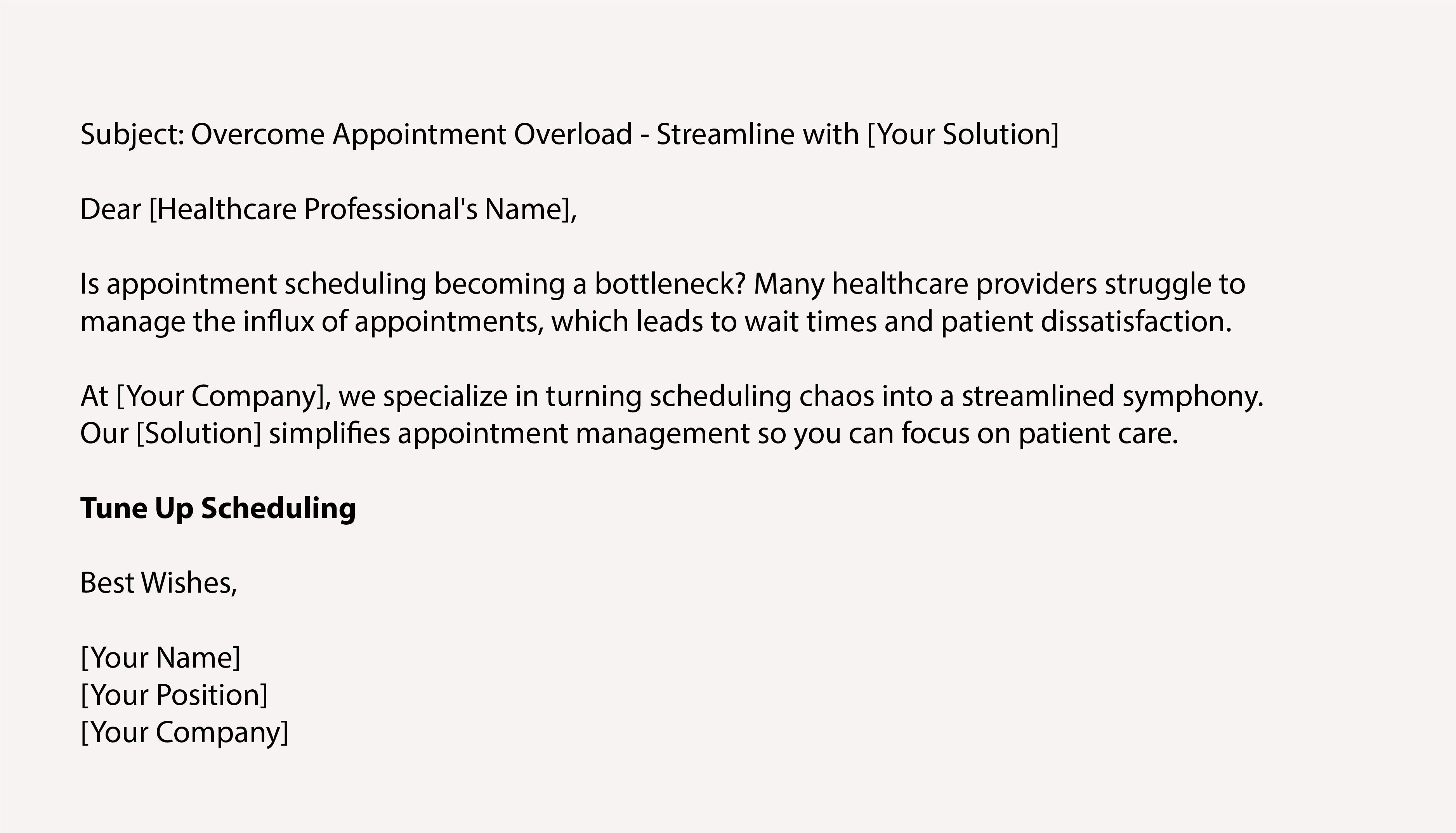
- The copy highlights a common and specific challenge: appointment scheduling.
- The CTA "Tune-Up Scheduling" uses a musical pun to add a light-hearted yet memorable touch, while implying an improvement in the process.
- The email suggests urgency and relief from the scheduling hassle, creating a direct link to the solution offered.
- The CTA button is described as green, which can imply 'go' or 'positive action,' and it stands out visually in the email.
4. Optimize for Mobile Screens
55% of emails are opened on mobile devices. Hence, your CTAs must account for smaller screens and touch interactions to ensure the best user experience.
To craft CTAs that perform well on mobile, you should follow these best practices:
- Make the CTAs large enough to be easily tapped on a small screen, with a recommended minimum size of 44x44 pixels. This size consideration helps prevent misclicks and enhances the user's ability to interact with the CTA.
- Position your CTA prominently within the email layout to ensure it's seen without extensive scrolling. Ideally, it should be at the top or center of the email, where the reader can easily spot it.
- Considering many mobile users prefer or have their devices set to dark mode, ensure your CTA is visible and aesthetically pleasing in light and dark environments. Thus, pick color schemes that are legible and appealing in both settings.
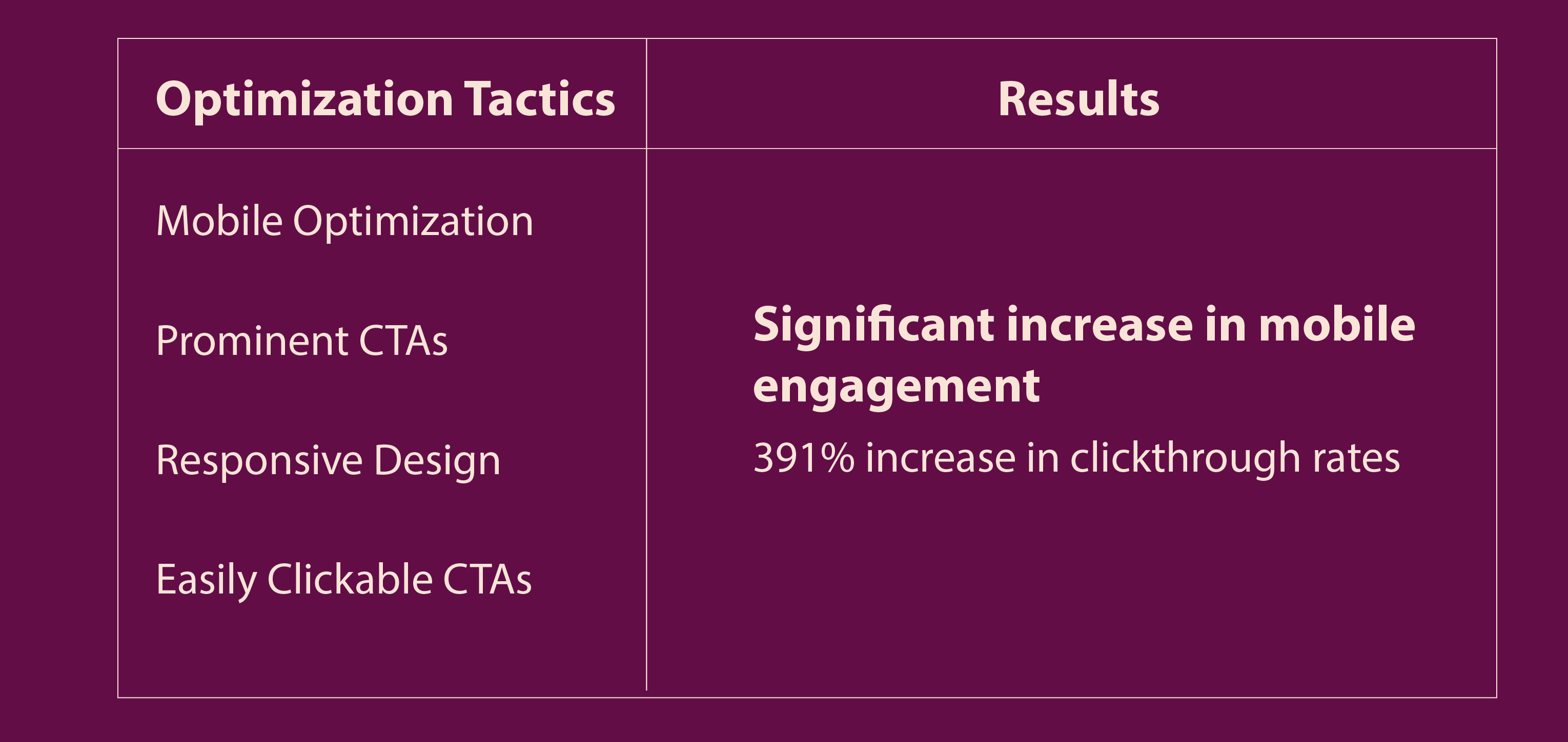
Consider this email campaign from Auto Trader:
They used the following mobile optimization techniques to achieve excellent outcomes:

As you can see, their focus on mobile optimization and prominent, clickable CTAs substantially increased engagement and clickthrough rates.
5. Implement A/B Testing for Different CTAs
A/B testing is an invaluable tool in your arsenal, allowing you to pinpoint the most effective CTAs by comparing different versions. Here’s how:
A. Test and Analyze CTAs
Set up controlled experiments by sending two variations of the same email, each with a different CTA. Later, you can measure which performs better regarding click-through and conversion rates.
This approach eliminates guesswork, providing concrete data on what resonates with your audience.
For instance, you might test a CTA that says "Get started now" against one that says "Book a free trial." This will give insight into whether your recipients are more motivated by direct action or educational content.
To accurately measure performance, it's important to change only one variable at a time—in this case, the CTA—while keeping other factors constant. This method ensures any difference in performance can be attributed solely to the CTA variation.
B. Evaluate Results and Iterate
Once your A/B test is complete, the next step is to analyze the results and draw actionable conclusions.
Look at the metrics that matter most to your campaign goals, such as open rate, click rate, and conversion rate. Understand that even minor differences can be significant at scale, and preferences may vary across different segments of your audience.
Use the insights you gain from A/B testing to refine your CTAs. For instance:
Illustration
- If you find that a casual tone leads to more clicks, consider adopting that style in future emails.
- Or, if a CTA that includes a specific benefit outperforms a generic one, you might start incorporating more detailed information into your CTAs moving forward.
Conclusion
Remember, the proper CTA can unlock many opportunities for your prospects. Embracing the techniques outlined to optimize your CTAs can significantly boost your cold email performance.
Take action now. With each email you send, you're reaching out — and inviting a potential partnership.
Ready to transform your cold email strategy? Partner with the leading outbound agency – Revnew. Let's start—your following breakthrough email is just a send button away. Contact us now.


